
Building a Creator Intelligence Desk: Turning Financial Market Coverage Into a Holographic Newsroom Format
Build a holographic newsroom that turns market-style analysis into a creator dashboard for launches, partnerships, and live industry coverage.
Why Stock Market Coverage Is the Perfect Blueprint for a Creator Intelligence Desk
Financial market video teams have already solved one of the hardest problems in modern publishing: how to turn chaotic, high-velocity information into a readable, repeatable broadcast format. They do it by combining live tickers, sector color, chart overlays, commentary, and structured editorial prompts into a single viewing experience. That same logic maps cleanly to creators covering launches, partnerships, product rumors, policy shifts, and fast-moving industry narratives. If you are building a creator dashboard for a holographic format, the stock-market playbook gives you a proven model for attention, hierarchy, and speed.
The source videos demonstrate a powerful pattern: an anchor or analyst does not simply “talk about news,” they perform interpretation in real time. A viewer sees a headline, a chart, a list of names, and a clear signal about what matters now. For creators in tech, media, consumer products, and AI, that same structure can become a holographic newsroom where every story is paired with data, timelines, and source references. The result is not just a prettier stream; it is a more trustworthy editorial system.
This matters because audiences have become trained to expect explanation, not just announcement. They want to know what a launch means relative to competitors, why a partnership matters, what the business model implies, and how the story may evolve in the next 24 hours. A holographic format lets you layer that context spatially, using data visualization and live analysis to create a newsroom that feels immediate, legible, and premium. For more on how creators can structure this kind of live experience, see our guide to live holographic events.
What a Creator Intelligence Desk Actually Is
It is a decision-making interface, not a generic stream layout
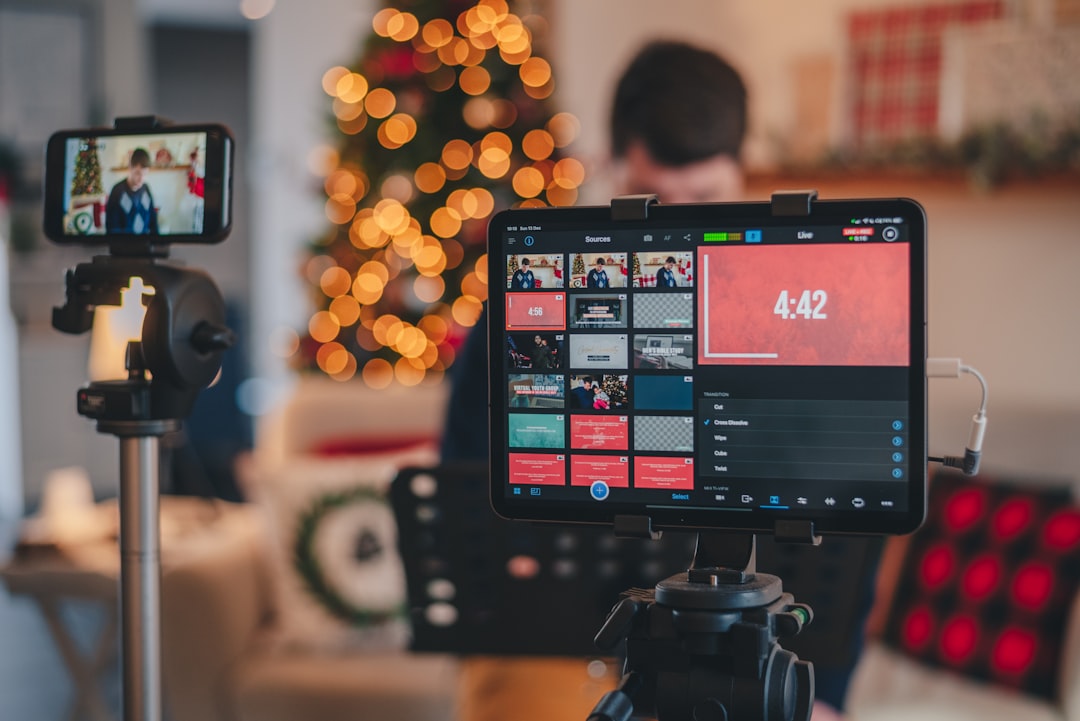
A creator intelligence desk is the editorial control room for fast-moving coverage. Instead of a static webcam and lower-third, the screen becomes a multi-layer workspace with story cards, source panels, timeline strips, speaker framing, and live status indicators. This design is especially useful for creators who track industries where updates arrive in waves, such as AI chips, creator economy tools, consumer launches, and media partnerships. It helps you communicate not only the story but also the confidence level behind it.
Think of it as a broadcast-grade version of a research terminal. The producer can see the source, the host can see the angle, and the audience can see the evidence. This is where broadcast graphics become operational infrastructure rather than decoration. When your dashboard is built correctly, it reduces hesitation on-air because the team knows which datapoints have been validated and which are still provisional.
It borrows the best habits from financial media
Financial analysis video formats succeed because they are modular. They can shift from macro context to sector focus to single-name breakdowns without losing coherence. A creator newsroom should mirror that structure by moving from the broad narrative to the specific evidence and then back out to the strategic takeaway. This is the core discipline behind any strong editorial automation workflow.
The practical advantage is consistency. When your audience knows that each segment will include a headline, source stack, relevance score, and next-step implication, they develop trust in the format itself. That trust compounds over time, especially if you are covering launches where speed matters but accuracy matters more. For a deeper view on how creators can organize high-tempo production, pair this concept with content operations best practices.
It creates a premium format for sponsors and partners
Brands do not just buy reach; they buy context, placement, and association. A holographic newsroom makes premium sponsorship inventory possible because stories are naturally segmented into modules with clear visual real estate. That means you can offer title sponsorships, sponsored data panels, and branded “analysis windows” without interrupting the core editorial flow. If you are exploring the commercial side of this format, our guide to monetization and business models is a useful companion.
For creators who also produce hybrid experiences, this structure extends beyond the stream into live events and recaps. In practice, the intelligence desk becomes an asset library: reusable templates, motion packages, and story overlays that can support live broadcasts, clips, and post-event summaries. That makes the investment easier to justify, particularly for teams trying to balance speed and production quality.
The Core Architecture of a Holographic Newsroom Format
Build the layout around information density, not visual novelty
A holographic newsroom should answer a simple question at all times: what should the viewer understand in the next five seconds? To do that, the interface needs a clear center of gravity, such as the anchor, the main story tile, or a live comparison panel. Around that center, place support layers for data, context, source credibility, and related stories. The best layouts feel like an analyst’s desk translated into spatial media, not a sci-fi gimmick.
Creators often overdesign the field of view and underdesign the decision flow. Instead, start with information hierarchy: headline, significance, evidence, outlook. Then add motion only where it clarifies, like a ticker for developing updates or a side rail for competing claims. This is where multi-source overlays are indispensable because they let you stack multiple inputs without turning the screen into visual noise.
Use zones for source validation, not just aesthetics
Every newsroom-style stream needs a visible method for verifying what the audience sees. One zone should show primary sources, one should show secondary reporting, and one should show your own interpretive notes. This makes the editorial process legible and reduces the risk of overclaiming on-air. For creators who work across news, product, and business categories, that transparency can become a competitive advantage.
The best analogy comes from data journalism: if viewers can see where the numbers came from, they are more likely to trust the analysis. That is why source cards, timestamps, and confidence labels should be part of your default visual language. For more on validating data before it enters a live environment, review how to verify business survey data before using it in your dashboards.
Make your spatial layers perform a function
In a holographic stream, depth is not an effect; it is a communication tool. Foreground elements should signal urgency, mid-ground should support explanation, and background should provide continuity. For instance, a launch story might keep the main product render in the foreground while placing timeline milestones and partner logos behind the presenter. That arrangement mimics how financial analysts separate price action, catalysts, and narrative themes.
This type of staging is especially powerful when you are covering hardware, partnerships, or platform launches, because the visuals can reinforce the business logic. If your newsroom regularly analyzes technical shifts, you can borrow ideas from navigating AI hardware evolution and adapt them to your own editorial stack.
Story Formats That Work Best in Creator Intelligence Coverage
Launch watch: the creator equivalent of market open
Launch watch is the closest thing creators have to a market-open show. The format is simple: a product or announcement drops, you open with the headline, and then you layer in implications, competition, and audience relevance. The key is to avoid treating the launch as the end of the story. Instead, position it as the first data point in a sequence of updates. That makes the stream useful for both immediate viewers and later replay audiences.
On-screen, this format benefits from a three-panel layout: what launched, what is different, and what happens next. This is also a great place for editorial automation because recurring launch episodes can auto-populate comparison tables, competitor references, and historical context. If you are building the production system behind this, compare notes with the logic used in streaming workflow design.
Partnership radar: follow the money and the distribution path
Financial coverage teaches a useful lesson: partnerships matter only when they change access, distribution, cost, or speed. A creator newsroom should evaluate partnerships by the same standard. When two companies announce a collaboration, your audience wants to know whether it expands reach, reduces friction, or creates a new monetization channel. That is the difference between relaying press release language and producing analysis.
A partnership radar segment works well when the screen displays the relationship map visually. Place the announcement in the center, then show adjacent nodes for product integration, channel access, and strategic implications. This is one of the best uses of live analysis because it benefits from immediate synthesis rather than delayed recap.
Market-move coverage for creators: from prices to perceptions
Creators in hardware, AI, and media do not need to be investors to borrow market-analysis language. Many of the most compelling stories involve pricing changes, platform shifts, creator payout changes, or ad-market pressure. In those cases, the value lies in making the invisible visible: what changed, what it means for creators, and what to monitor next. This is where a newsroom format can outperform a standard commentary video.
If your audience cares about how one event alters the competitive landscape, use a live map of the ecosystem to show winners, threats, and unknowns. You can even model it after the logic used in fast-response business reporting. For a practical comparison point, see industry news and partnerships coverage patterns and adapt the structural idea, not the topical focus.
Technical Stack: Capture, Rendering, and Streaming for Spatial News
Capture your host and your assets for compositing later
A strong holographic newsroom begins with disciplined capture. Record the host cleanly, but also capture high-resolution product assets, charts, screenshots, and motion plates that can be composited into the final scene. Creators often underestimate how much flexibility they gain when the presenter is shot against a controlled background with consistent lighting and enough resolution for cropping. That flexibility becomes critical when the same segment must later be repackaged into vertical clips, highlight reels, or sponsor cuts.
When planning the capture pipeline, think in layers: primary video, alpha-friendly graphics, source stills, and optional B-roll. This allows your team to switch between live switching and post-production enhancement without rebuilding the entire scene. For creators who need a deeper toolchain perspective, our overview of hardware and platform reviews helps clarify vendor categories and tradeoffs.
Render for clarity before you render for spectacle
Rendering for holographic news is not about adding the most effects. It is about preserving legibility when multiple information types are on screen at once. Fonts must remain readable, motion must support rather than distract, and charts must survive compression during streaming. If your graphics look good only in a render preview but fail in a live broadcast, the workflow is wrong.
Creators should favor scene templates that are modular and lightweight. Each section of the program should have a render-safe fallback that can survive lower bandwidth, latency spikes, or scene transitions. This is especially important if you are using multi-source overlays because each source adds both editorial value and technical risk.
Stream with resilience, not just ambition
A newsroom-style stream must tolerate data glitches, asset delays, and live guest changes. That means your streaming workflow needs fallback scenes, watchdog timers, and a way to isolate bad sources without taking down the entire program. The lesson from platform engineering is simple: resilience is a feature of the editorial system, not just the infrastructure stack. For a related operational mindset, review real-time cache monitoring for high-throughput AI and analytics workloads, which offers useful parallels for handling live data pressure.
This is where content teams should test for failure as often as they test for polish. Can the show continue if one source feed drops? Can the anchor still present if a chart API times out? Can the newsroom shift to a “minimal mode” layout in under ten seconds? Those questions turn your stream from a fragile demo into a reliable editorial product.
Editorial Automation That Makes the Desk Worth Building
Automate the routine, preserve the judgment
The best editorial automation does not replace editorial thinking; it removes repetitive setup work. In a creator intelligence desk, automation should pre-fill story cards, summarize incoming alerts, generate comparison tables, and tag stories by category or urgency. That gives hosts more time to analyze and less time to search. The viewer experiences a faster, cleaner show because the team is not wasting live minutes on setup tasks.
Automation also helps standardize the format across recurring series. If every launch watch segment uses the same information stack, your audience learns the rhythm quickly. That predictability increases retention because people know where to look for the headline, the proof, and the takeaway. It also makes the show easier to scale across multiple hosts or producers.
Use structured prompts for live editorial decisions
One of the most effective ways to keep a creator newsroom disciplined is to build prompt templates for on-air use. Examples include: What changed since the previous update? Who benefits? What is the next measurable milestone? What is missing from the announcement? These prompts help the host avoid filler and guide the conversation toward useful analysis.
Structured prompts are especially valuable when covering ambiguous stories or partially verified claims. They allow you to stay transparent about uncertainty while still delivering value. This is the same principle used in strong market commentary, where the best analysts distinguish between signal, noise, and hypothesis.
Turn your desk into a content factory
Once the live show ends, the dashboard should produce outputs for short clips, social cards, newsletter summaries, and long-form recaps. A creator newsroom becomes more valuable when every live session creates multiple derivative assets. That is why it is important to design the stream from the beginning with repurposing in mind. Motion graphics, lower-thirds, and story cards should all be modular enough to survive editing into smaller formats.
For creators who want to systematize this approach, the ideas in creator tools and tutorials can help shape a pipeline that balances production speed with editorial quality. Pair that with a careful understanding of your audience’s content consumption habits, and you can turn one live session into an ecosystem of assets.
Comparison Table: Traditional Creator Streams vs. Creator Intelligence Desk
| Dimension | Traditional Creator Stream | Creator Intelligence Desk | Why It Matters |
|---|---|---|---|
| Story structure | Open conversation, loose agenda | Headline, evidence, implication, next step | Improves clarity and repeatability |
| Visual layer | Webcam plus occasional slides | Multi-source overlays, charts, source cards | Supports live analysis and trust |
| Editorial flow | Manual, reactive, inconsistent | Template-driven with automation | Reduces setup time and on-air friction |
| Audience value | Personality-led commentary | Decision support and interpretation | Attracts research-minded viewers and buyers |
| Monetization options | Ads, basic sponsorships | Sponsor modules, premium insights, branded data views | Creates higher-value inventory |
| Repurposing | Clips require heavy editing | Assets are designed for modular reuse | Scales content operations efficiently |
How to Build the Workflow in Practice
Start with an editorial map, not a software purchase
Teams often begin with tools and only later define the editorial system. That is backward. First map the story types you cover, the speed at which they change, and the level of verification required for each. Then decide what each layer of the dashboard must show: source provenance, timeline, competitor context, and call-to-action. Once the workflow is defined, the tool stack becomes much easier to choose.
A good way to test the design is to create one template per recurring story type. For example, a launch template may include product, announcement, feature delta, and market implications. A partnership template may include parties, integration depth, strategic benefit, and risk. These templates become the backbone of your newsroom and keep production scalable.
Assign roles like a broadcast operation
Even small teams benefit from clear role separation. One person gathers sources, one person validates and updates the dashboard, one host narrates, and one producer watches the technical health of the stream. When everyone knows their lane, the show feels calmer and more authoritative. This setup also makes it easier to train replacements and scale your production cadence.
If your team is distributed, create a shared command channel for breaking updates and a shared visual vocabulary for story confidence. That way, the host does not need to improvise labels or guess at source status. For teams looking to borrow from collaborative operating models, the logic behind how changing your role can strengthen your data team translates well to newsroom production.
Pressure-test your desk before you go live
Before launching the format publicly, run a series of dress rehearsals that simulate broken sources, late-arriving guests, and conflicting headlines. The purpose is not to create perfection; it is to reveal where the dashboard fails to communicate clearly under stress. These rehearsals should include timing tests for scene changes, voice-over transitions, and fallback graphics.
Creators who build in this kind of resilience save enormous time later. They also avoid the trap of assuming that more graphics automatically means better communication. In live formats, speed and comprehensibility beat spectacle almost every time.
Case-Study Logic: What Financial News Teaches Creators About Attention
Speed wins only when it is paired with interpretation
Market videos attract viewers because they offer quick orientation during uncertainty. But the true value is not the speed alone; it is the analyst’s ability to tell viewers what the event means. Creator coverage works the same way. When a platform changes revenue terms or a company announces a strategic partnership, your job is to help viewers understand the business significance before the narrative hardens elsewhere.
That is why the best analogy is not “news flash” but “decision brief.” You are not just informing people, you are helping them decide what to watch, what to ignore, and what to revisit later. For creators covering fast-moving business stories, that decision-support role is a major differentiator.
Trust compounds when the format is consistent
Audiences return to financial analysis shows because they know the format and trust the method. A creator intelligence desk can build the same habit if every episode follows a recognizable sequence and every claim is visually supported. Over time, the format itself becomes a brand asset. That consistency also helps sponsors because they know exactly what kind of environment they are entering.
This is also where your visual identity matters. Use typography, chart styles, and motion grammar consistently so the desk feels like an engineered system rather than a series of random screens. If you want more perspective on audience habit-building, community and fan experiences offers useful ideas for retention and engagement.
Premium formats create premium expectations
Once you move from standard streaming to holographic newsroom coverage, your audience expects higher signal density and stronger verification. That is a good thing. Premium formats attract serious viewers, advertisers, and partners who value sophistication. It also forces the team to be more deliberate about sourcing and framing, which improves overall editorial quality.
To support that standard, keep a close eye on platform partnerships, data integrations, and new rendering workflows. In a fragmented ecosystem, the creators who win will be the ones who can stitch together capture, rendering, and distribution into a coherent production system. That is the practical advantage of thinking like a newsroom and building like a technologist.
Common Mistakes to Avoid When Building a Holographic Newsroom
Don’t overload the screen with every available signal
The biggest mistake is trying to make the desk show everything at once. Too many charts, headlines, and overlays create cognitive overload and make the host look secondary to the graphics. Instead, treat every data layer as a question: does this help the audience understand the main story? If not, it belongs in a backup layer or post-show asset.
Strong editorial design is not about maximalism. It is about choosing the most useful layer at the right moment. That restraint is what separates a credible analysis environment from a flashy demo.
Don’t confuse automation with objectivity
Automated summaries and alerts are useful, but they do not replace human judgment. In particular, creators must be careful when data sources disagree or when the story is still developing. Show the uncertainty, label the source, and state what you do not yet know. Viewers trust creators more when they are transparent about the limits of live information.
If your workflow includes third-party feeds, always inspect where their data originates and how frequently it updates. In a newsroom setting, the provenance of the information matters as much as the information itself. This is why the discipline of verification must stay close to the live floor.
Don’t build for a one-off event if you want a durable asset
Many creators design event graphics that work for a single broadcast but collapse under repeat use. A true intelligence desk should be a reusable system with templates, scene variants, and modular asset slots. That way the production scales across weekly shows, breaking news, and partner-sponsored segments. Reusability is the difference between a stunt and a platform.
For creators interested in hybrid and repeatable live programming, the principles behind the power of live music events are highly relevant because they demonstrate how live formats can grow audience reach while preserving event energy.
Conclusion: The Future of Creator Analysis Is Spatial, Structured, and Operational
The creator intelligence desk is more than a new overlay package. It is a production philosophy that combines the rigor of market coverage with the visual language of spatial media. By translating stock-market analysis videos into a holographic newsroom, creators can cover launches, partnerships, and industry shifts with greater speed, clarity, and trust. The format helps audiences understand what matters, why it matters, and what to watch next.
For creators building in fast-moving sectors, this is a rare opportunity: a format that improves editorial quality while also expanding commercial potential. It supports stronger sponsorship packages, more reusable content assets, and better audience retention. If you are serious about building a future-proof creator operation, start with the newsroom logic, then layer in the holographic execution.
To continue planning your stack, revisit our guides on creator dashboards, holographic newsroom design, multi-source overlays, and editorial automation. Together, they form the foundation of a broadcast environment built for the next generation of creators.
FAQ
What is a creator intelligence desk?
A creator intelligence desk is a live production setup that combines editorial analysis, data visualization, source validation, and broadcast graphics into one spatial interface. It is designed for fast-moving coverage where viewers need context, not just headlines.
How is a holographic newsroom different from a normal livestream?
A normal livestream usually centers on the host and a few static visuals. A holographic newsroom uses layered spatial graphics, live data panels, and structured story modules so the audience can follow complex information more easily.
What kinds of stories work best in this format?
Launches, partnerships, industry shifts, pricing changes, product comparisons, and breaking developments work especially well because they benefit from real-time interpretation and layered context.
Do I need expensive hardware to start?
Not necessarily. You can begin with a disciplined workflow, a few reusable templates, clean capture, and simple overlays. The biggest gains usually come from editorial structure and source validation before advanced hardware.
How do I keep the stream trustworthy when news changes quickly?
Use source labels, timestamps, fallback graphics, and a clear confidence system. If a claim is unconfirmed, say so on-air and visually separate it from verified facts.
What is the main monetization advantage of this format?
The format creates premium sponsorship opportunities because it offers specific, high-trust placements such as data panels, story modules, and branded analysis segments rather than generic ad inventory.
Related Reading
- Live Holographic Events - Learn how spatial broadcasts can be structured for repeatable audience engagement.
- Creator Tools and Tutorials - Build a practical production stack for capture, rendering, and streaming.
- Hardware and Platform Reviews - Compare the vendors and systems that power modern creator workflows.
- Monetization and Business Models - Explore sponsorship, ticketing, and premium content strategies.
- Community and Fan Experiences - Design interactive formats that turn viewers into participants.
Related Topics
Jordan Vale
Senior SEO Content Strategist
Senior editor and content strategist. Writing about technology, design, and the future of digital media. Follow along for deep dives into the industry's moving parts.
Up Next
More stories handpicked for you

The Creator’s New Trust Layer: How to Build Risk, Disclosure, and Editorial Guardrails Into Holographic Streams

How B2B Thought Leadership Can Become a Live Holographic Content Engine
From Market Volatility to Immersive Theater: How to Turn Live Financial Chaos Into a Holographic Viewer Experience
From Market Whipsaw to Live Holographic Event: Designing Real-Time Reaction Shows for Volatile News Cycles

From Market Whipsaws to Live Show Control: Building a Holographic Broadcast Risk Layer for News-Driven Events
From Our Network
Trending stories across our publication group

Unlocking User-Generated Content: The Power of Live Sports Streaming

Staying Competitive in a Growing Market: Strategies for Creators Amid Rising Costs

The 5-Question Template Creators Can Use for Better Audience Engagement

How to Turn Conference Conversations Into High-Performing Video Content
The Impact of Ads on Creator Revenue: Navigating the App Store Changes